
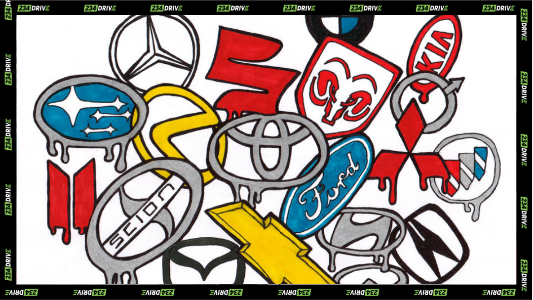
Car logos often look simple, but many quietly carry decades of history, mergers, and changing brand identity. | Source: Deviantart
Car logos may look simple, but many were designed to tell a story. Some reflect company mergers, others hint at values like trust or progress, and a few quietly dropped old symbols that no longer fit what it wants in its modern era. From Toyota’s overlapping ovals to Audi’s linked rings to Cadillac’s missing ducks, these badges reveal how major car brands think about identity, history, and where they’re headed.
Toyota: Built Around Trust and Progress
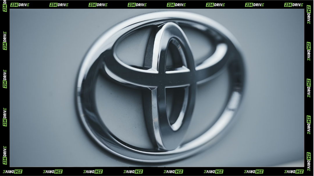
Toyota’s overlapping ovals focus on trust, connection, and long-term progress rather than visual flair or hidden tricks. | Source: Unsplash
Toyota introduced its current logo in 1989, using it to mark 50 years as a company. The emblem uses three overlapping ovals inside a larger one. Toyota says the two inner ovals represent the bond between the customer and the car, while the outer oval stands for global reach and future growth.
The shapes also form a subtle “T” and resemble a steering wheel, tying the logo directly to driving. While some online chatter had initially claimed the logo was made so that it could spell out every letter in “Toyota”, the company hasn’t come out in support of that idea. Toyota’s own explanation focuses on connection, reliability, and long-term innovation—which lines up closely with how the brand operates in real life.
Audi: Four Rings, One Survival Story
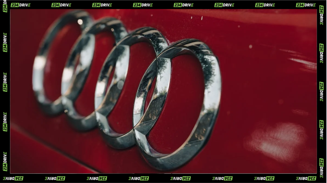
Audi’s four interlocked rings reflect a survival merger that shaped the brand long before modern performance became its identity. | Source: pexels
Audi’s four rings don’t represent technology or drivetrain systems. They come from history. In 1932, four struggling German car companies—Audi, Horch, DKW, and Wanderer—merged to survive economic pressure. The new group was called Auto Union, and each ring represents one of those companies.
Auto Union gained attention through motorsport in the 1930s, using advanced race car designs that challenged established rivals. After World War II split Germany in two, the company rebuilt in the West. Volkswagen later took control and made Audi the main brand, keeping the four-ring logo as a reminder of its merged origins. Today, the rings still stand for unity and resilience rather than style alone.
Cadillac: Leaving the Past Behind
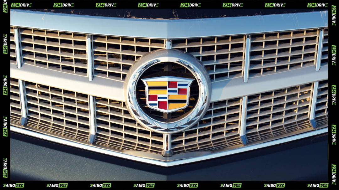
Cadillac’s modern badge strips back detail, signaling a shift toward cleaner design and contemporary global luxury. | Source: SunsetCadillac
While Audi holds on to its origin for the future, American carmaker Cadillac didn’t feel a similar level of attachment. Cadillac’s early logo came from a coat of arms linked to Antoine de la Mothe Cadillac, the French explorer associated with Detroit’s founding. That crest included merlettes—mythical birds often mistaken for ducks—which symbolise perseverance and faith in old European heraldry.
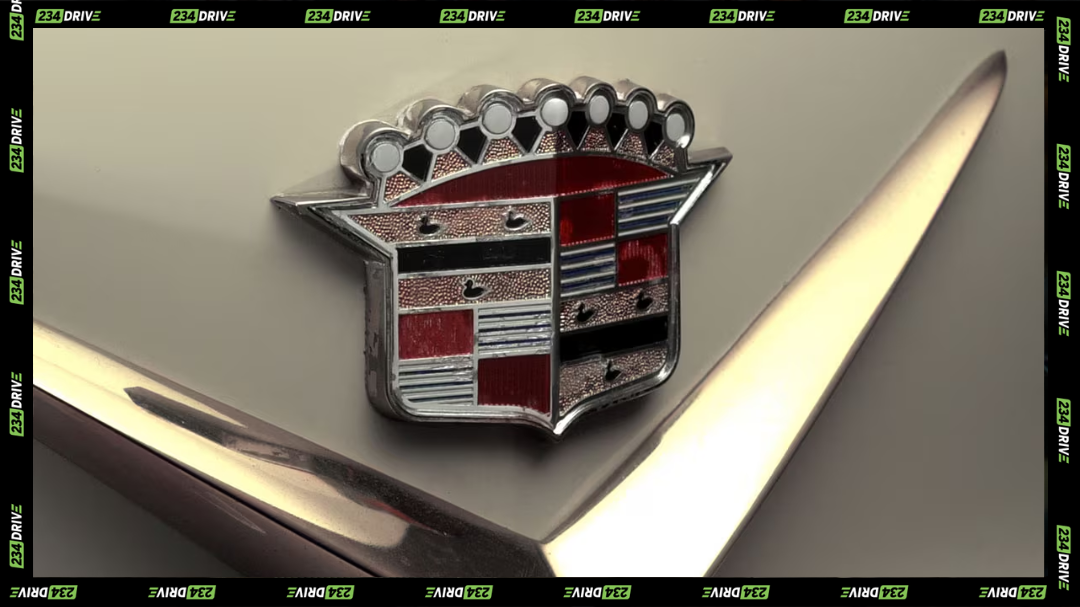
Cadillac’s older crest leaned heavily on heritage symbols, borrowing from European coats of arms to project prestige and tradition. | Source: Cadillac
Over time, Cadillac updated its logo many times, adding and removing elements to match changing tastes. In 2000, the company removed the birds entirely, choosing a cleaner and more modern look. The decision wasn’t about history being wrong—it was about relevance. Today’s Cadillac badge still nods to heritage but avoids symbols that no longer connect with modern buyers.
Why Brand Families Matter
Logos also make more sense when you understand who owns what. Many automakers operate multiple brands under one group. For example, Lexus sits under Toyota, sharing engineering foundations while targeting a different audience. These relationships influence design, technology, and branding choices long before a logo ever reaches a hood.